DailySigning

Close
DailySigning

2023

20 weeks

Group of 3

Screen design

Coding

Video
Table of content
Challenge
Defining assignment
Research
Design
Final design
A lesson
Design guidelines
Final presentation
Main takeaway
Around 430 million people worldwide have disabling hearing loss, yet sign language is still unfamiliar to most of us (including myself). Imagine learning it as easily and playfully as a Duolingo course. For my final high school course, Onderzoek & Ontwerp (Research & Development), we started developing an app that makes this possible: accessible, game-like lessons that help anyone pick up real signs step by step. We wrapped up the project with an Apple-inspired presentation showcasing everything we created over the past half year.
Challenge
The challenge was very broad: we could come up with almost anything we wanted, as long as it involved research and — you guessed it — development. We landed on this topic because a family member of someone in our group took an extensive sign language course and realized how time-consuming and expensive it was. And honestly, it’s surprising — there are countless apps for learning spoken languages, yet barely any proper apps for learning sign language.
Our challenge was to do research on sign language, design the most important screens of the app, build a few working components, and create a strong presentation to sell our idea at the end.
Defining assignment
First, we defined the final assignment. This course lasts roughly half a year and we’re a team of three. Since we only had 4 hours a week of class to work on this, and we were also graduating, we didn’t have . oo much time to bring an entire app to the market - especially since we didn’t have much experience in designing, let alone coding, so we set some clear boundaires:

Not coding the entire app
Since we didn’t really have any coding experience, we focused on coding the essentials (Swift).

iOS only
Although the app is supposed to be available on iOS and Android, we only focussed on iOS for now.

Dutch sign language only
Did you know ever country has their own sign language? We only focused on Dutch sign language.

No ads
We want the app to fund itself through ads, but we didn’t focus on actually implementing them yet
Research
We started by identifying the main problem: millions of Deaf and hard-of-hearing people face communication barriers, but accessible tools for learning sign language are limited, outdated, or incomplete. To understand the context, we researched how sign languages work, how they differ across countries, and which learning methods currently exist — from courses and websites to apps and social media. We analyzed popular sign-language apps and wrote down their strengths and weaknesses. This confirmed our observation: there is need for a more modern, structured, and sentence-based learning tool.
We also investigated how apps are built (website, web-app or native app), and studied programming options before choosing SwiftUI as our basis. Interviews with experts and potential users helped us define what the app should (and shouldn’t) do. We turned all these insights into a clear set of requirements, such as offline use, accessibility, a clean interface, and a focus on real learning rather than just fun.
By combining the user needs, technical possibilities, and market gaps, we shaped the foundation for our first concept: an interactive, Duolingo-style app that teaches everyday sign language in short, structured lessons.
Design
Next, we moved on to designing. We designed the screens in Adobe XD. For example, here are some iterations of the topic selection:
Themes with clipart drawings as covers.
Themes with icons as covers.
Themes with cover photo’s.
Final design
Here is an overview of the final screens we designed:
The app starts with a friendly welcome screen where users can log in or create an account. It introduces the app’s purpose and shows the DailySigning branding.
A quick overview screen with your streak, the coins you earned, updates, and your current lesson. It motivates users to keep learning with clear progress elements.
A playful shop where users can buy outfits for their avatar using the coins they earn. It has a seasonal header, search bar, and changing deals to keep things fun.
The core of the app. Users choose from different themes (like colors, food, travel). Special intro themes teach basics like the alphabet and numbers. Search and filters make it easy to navigate.
A feed with articles about Deaf culture, sign language tips, and relevant events. It includes filters, dates, and simple interactions like comments.
A personal page where users customize their avatar, manage settings, edit account info, and switch between light and dark mode. It also includes accessibility options.
A lesson
Here is what a lesson looks like:
The overview of one lesson
A question where you get a video of a word and need to speak out loud the answer.
When you finished a lesson, you get this screen.
Design guidelines
Here are the design guidelines we made for our app:
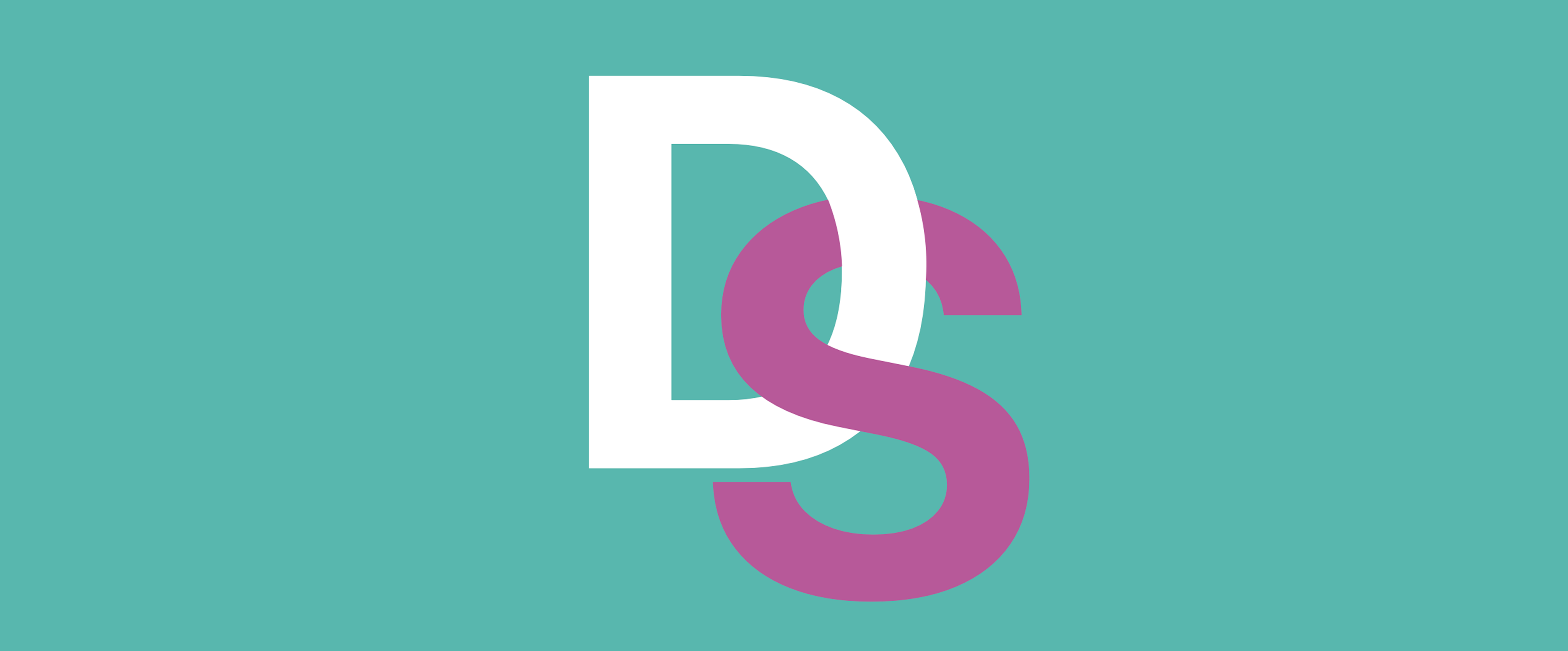
Logo
The logo contains two letters: D and S representing the apps name: Daily Signing. We have two version: one with a green background and a transparent one.
Logo with transparent background.
Logo with a green background.
Font
For the font we decided to go with something simple: We use Apple’s default San Francisco font.
The lazy fox jumps over the quick brown dog.
SF Pro Text
Colors
Here are all the colors we used for our project.
Dusty Teal
Main brand color.
R
88
G
183
B
174
#
58B7AE
Dusty Rose
Complementary main brand color.
R
183
G
89
B
153
#
B75999
Gray
Gray used for various backgrounds.
R
242
G
242
B
242
#
F2F2F2
Dark gray
Dark gray used for main text body.
R
44
G
44
B
46
#
2C2C2E
Final presentation
For our final presentation we made some great ideas: We made a 20 minute presentation and included some short videos throughout to keep the presentation engaging. We made the slides very minimal and only added the essentials. To show the app, we added a live-demo where everyone could see what was going on on my screen. And to top it all off: we printed shirts with the logo on it to sell our idea.
Here is an overview of the most important slides. Feel free to download them at the end of this page:
Introduction screen.
Table of contents. We used a so-called designcycle.
Indicating clear boundaries.
List with requirements.
Final design (my phone screen would be visible here.)
Questions we asked during testing
Evaluation
Final Apple-like summary
Main takeaway
This project taught me how to approach a design challenge from start to finish: researching a problem, understanding user needs, comparing existing solutions, and translating all that into a clear concept. I learned how to define requirements and make design decisions based on real insights instead of assumptions. It also gave me a first introduction to app development and SwiftUI, which helped me understand what’s technically realistic. Most importantly, it improved my teamwork, planning, and communication skills, from coordinating tasks to presenting our work in a clear, structured way.
My group mates and me after our final presentation.
Download
Feel free to download the files below.

Final report
File in Dutch
・
PDF document
・
22.1 MB

Final presentation slides
File in Dutch
・
PDF document
・
21.2 MB

Please refrain from modifying or distributing this content. Kindly ensure proper credit is given when using it.
Thomas Tolenaar
Constantly learning, iterating, and designing.
Made in the Netherlands, 2026